1:23 pm
Is Your Retail Space Designed to Sell?
You can have the best products in the world, the most knowledgeable staff and a killer location. But if a commercial architect with a firm understanding of retail design strategies doesn’t design your store, you’ll be losing out on sales.
Most national retailers have set design standards that dictate the layout of all locations. They have been meticulously created based on proven insights into consumer behaviour. While some minor modifications may be required to accommodate the size and orientation of a particular leased space, these architectural plans form the basis of every build.
Let’s look at the key components of a retail design standard.
The floorplan: setting the direction for success.
The floorplan of your store will determine how a customer interacts with your merchandise and your staff. There are four standard retail floorplans. Determining which is right for your store will depend on several factors:
- The size and layout of your space
- The products and services you offer
- The volume (and value) of merchandise
- The need for change rooms, etc.
In choosing a floor plan, you’ll want to ensure that customers have plenty of room to browse and shop without bumping into displays and other customers. Building code will also set guidelines you must meet to ensure your store is accessible to those with disabilities.
Four common floorplans.
1. Grid layout
How people navigate: Walking up and down product aisles arranged by category.
Best suited to: Stores with a large and varied product selection. Allows a customer to find what they want easily and then proceed to checkout.
Examples: The Dollar Store, Home Depot
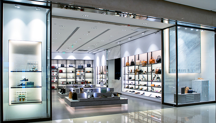
2. Loop layout
How people navigate: Customers browse merchandise along the outsides of the store and are funnelled back up the middle for maximum exposure to merchandise.
Best suited to: Businesses with a mid-size product offering, and stores that can utilize walls to display goods (such as retail clothing or shoe stores).
Examples: Footlocker, Roots, Eddie Bauer, Bed Bath & Beyond
3. Free-flow layout
How people navigate: Counters are set up to create angles in the store that are conducive to random browsing.
Best suited to: Smaller spaces and businesses with limited product offerings.
Examples: Fossil, People’s Jewellers
4. Mixed layout
How people navigate: A combination of the above.
Best suited to: Large spaces with diverse product offerings.
Examples: Indigo, Winners
Cashing-in – checkout till placement.
The location of a checkout till will be determined by the store layout, customer convenience and security. Most stores will either put the checkout area in the centre of the store or near the entrance. If customers will be leaving with a sizable amount of merchandise, it is handy to have your checkout as close to the exit as possible. Checkouts should be situated for customer convenience and visibility.
To guard against theft, the staff at the checkout counters should be able to clearly view the entire store with no blind spots. Mirror placement can help alleviate this concern.
It is important to determine the location of your checkout counter prior to construction because the wiring for POS systems will need to be incorporated into the design. It is not something that can be easily changed at a later date.
A good merchandising tip is to strategically place impulse purchase items close to the till. A 2018 survey by Slickdeals.net revealed the typical US consumer spends $5,400/year on impulse buys (averaging 3 impulse purchased per week).
A spotlight on driving sales – lighting.
Choosing the right lighting helps draw attention to your merchandise and display in the best possible light. An architectural/design firm will measure the output of light to set the right mood while maintaining ample visibility. There are several ways to light a store:
- Overhead ambient lighting – This is general lighting. The intensity sets the mood.
- Accent lighting – Light is directed to focus on specific displays to make them stand out.
- Task lighting – Functional lighting that allows your employees and customers to see what they are doing.
Dressed for success – change rooms.
Where space allows, change rooms should be placed in a logical location with central access to your merchandise sections. Unisex change rooms are now the norm in stores catering to male and female fashions. Don’t forget to include mirrors inside or outside of the change room.
Out of sight, top of mind: the backroom.
Many businesses overlook the need for adequate storage space that offers quick access when employees need to find an item that is not on the shelf. A stockroom that is too small or poorly planned can lead to inefficiency and make your job harder. Today, businesses are finding ways to minimize office or desk requirements and are instead dedicating the space to storage.
Plan to thrive in your space.
By following proven design principals, you can ensure your retail space sells as hard as you do. If you are part of a national brand, you will be provided with a tried and true floorplan to follow – and may simply need an engineering and design firm to adapt it to your space. If you are designing a store from scratch, be sure to connect with a commercial architect with experience in the retail sector. Your cash register will thank you.